[Note: This is a guest post by @jeuasommenulle, who usually talks mostly about banking on Twitter, but has been tweeting a lot about the reproduction number of COVID-19 lately. He recently told me that he’d been working on a model that bears on something puzzling about that, which sounded interesting, so I encouraged him to write a post that briefly described the model and told him that I would publish it on my blog if he did. The result is the post you can find below, which I think many of you will find interesting. If you have remarks, criticisms and/or questions, you can leave a comment here or reach out to him on Twitter.]
As some know, I’ve been tweeting estimates of R, the instantaneous reproduction number of the COVID-19 pandemic in many countries. You can check here the precise definition of R, but in a nutshell it is the number of people infected by someone who is infected. If R>1 the epidemic grows exponentially, if R<1 it eventually vanishes. More than cases, deaths, etc., it is the key metric to see if an epidemy is under control or not.
The problem I have had with those estimates, is that after a strong drop in R due to the lockdown measures, R seems to be stagnating in many countries, most notably France or Italy.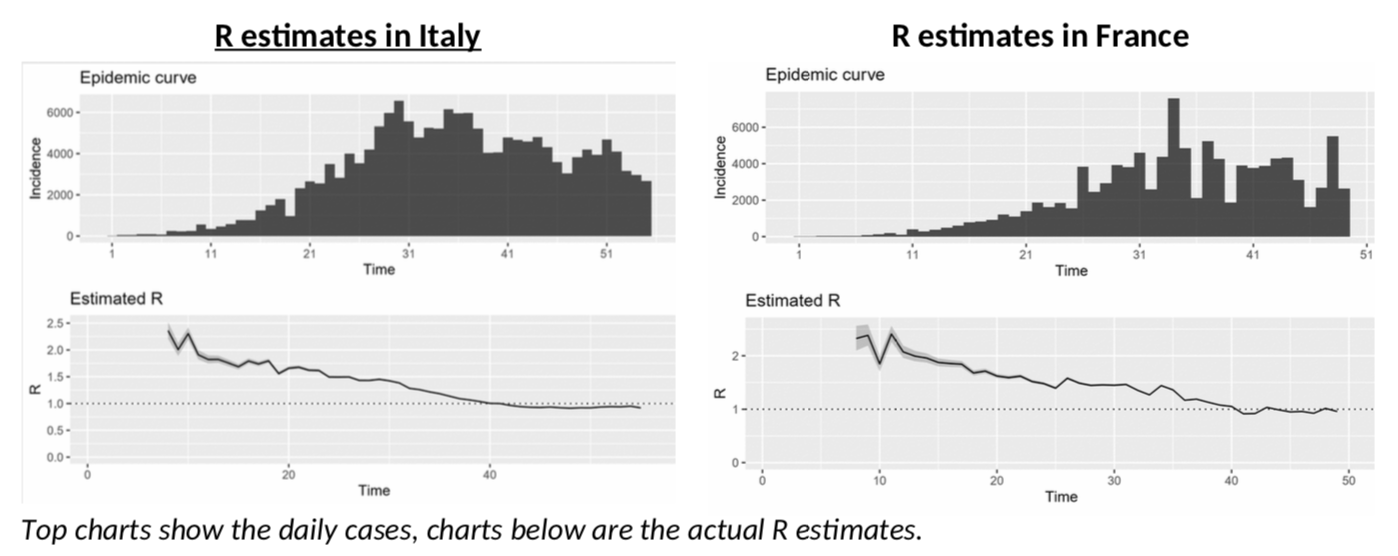
Italy, in particular, is depressing! After more than a month of lockdown, the epidemy is only “under control” and not receding, with R just slightly below 1? China only started to ease lockdown measures when R was at 0.3… And Italy is not going there any time soon, or so it seems. Will we all go nuts as we have to stay another six months in quarantine … not to mention total economic meltdown?
What could we be missing here? Could something explain the stagnating R and give us some hope?
Back to (not so) basics
To answer that question, we obviously need to understand how R is estimated. I won’t bore you with the details (see here for example), because they are a bit tedious, as you can see from this nice equation which shows the distribution probability of R.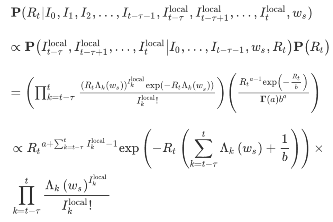
If you hate equations, just remember the general idea: every infected person contaminates R persons – the “secondary cases”. And the secondary cases show up in case statistics when they effectively have symptoms. Logically, what is crucial here is the time it takes to “infect” someone else, not with the actual virus, but with symptoms. This is linked to what epidemiologists call the serial interval, or SI, and it is a crucial factor in estimating R. The concept is nicely illustrated in this chart.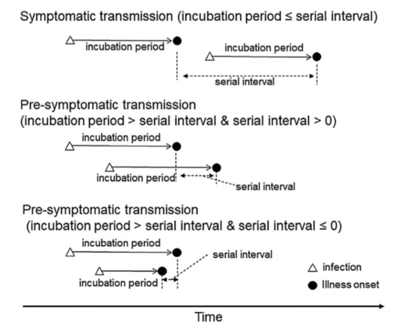
Meet the serial interval
So how do we get that SI? Well, the bad news is that SI is not just a number, it has a full probability distribution. Several authors have published estimates. This paper claims that the SI looks like this: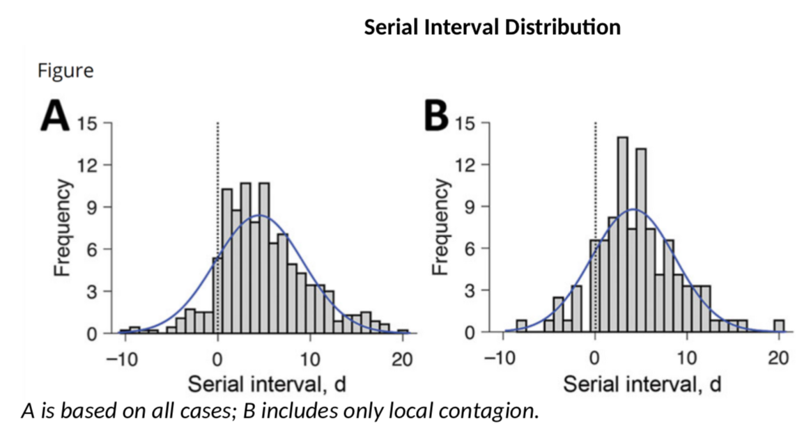
These authors have a SI of 3.96 days on average with a standard deviation of 4.75. This is consistent with this paper which gives 4.7 and 2.9 days. However, earlier calculations had suggested that the mean serial interval was 7.5 days with a 5.3 to 19 confidence interval, a much higher value. My calculations above use a mean SI of 4 and a SD of 4.75. What if the actual SI was different? Would R be significantly different? Let’s do the simulation (once we have the data for cases and SI, we can use the wonderful EpiEstim package to estimate R – developed in… R, the coding language, obviously).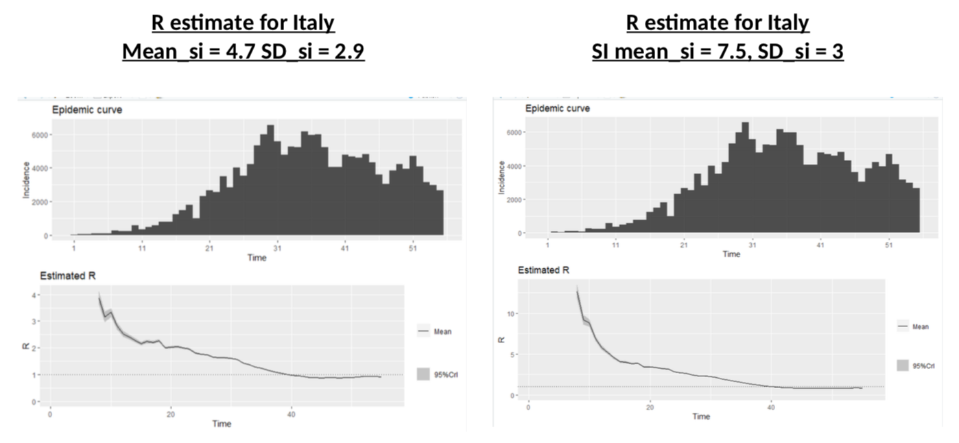
Nothing to be cheerful about: different SI distributions change dramatically the R at the onset of the crisis, and illustrate more or less the impact of the lockdown, but the current value of R is almost unchanged.
Damn. So, we’re doomed?
Hmm, maybe not. Because we have to go back to the very first input we need in the calculations: the daily number of cases. Are they accurate? I’m not suggesting Italy or France are faking their data (in fact, I have even suggested they are not.) But one thing is obvious: testing has increased a lot, probably as the result of EU countries finally sorting out their supply chains mess and having access to testing kits. Could increased testing be the reason we are seeing more cases and calculating stable R? It is a crucial question – in fact probably the most crucial one if we want to understand the real trend of this pandemic.
How is testing impacting the data?
I’ve read many positive comments on this topic. The general idea is this: “we are testing more, so we are seeing more cases, but that is only because now we are looking for them”. Fair enough, that makes sense. But what about this: “the pandemic is spreading, so we are seeing more people with symptoms, so we are testing more”. That also makes perfect sense. And believe me, I hope this second option is not true, but how do I know it is not?
How do we make the difference between the two theories?
The first thing that pointed me to an idea that could help to solve (or contribute to understand!) the problem, is this chart, which illustrates the share of the testing which is done in France on each age bands (as defined in the French data). There is clearly something odd going on here: more tests on the 45-64y age group and less in the 65-74y and 75y+ groups. But why? What’s happening?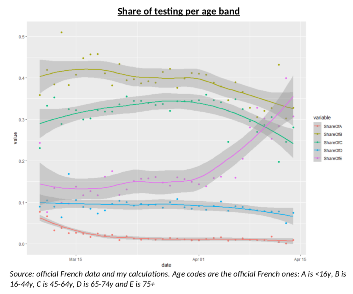
My intuition was rather straightforward: French authorities were only testing severe cases, mostly older people, but as testing kits have been more available, testing is now done on a wider range of the population (but still almost never on children.) But again, always the same question: how do I know this is true? I guess it is now time to create a model.
The Model
As I often do when I build a model, I tried to use simple common sense, rather than sophisticated approaches. The building blocks are based on my understanding (which I believe is quite good, for all sorts of reasons) of what is happening in the French healthcare system, after the Stage 3 of the pandemic was declared, i.e. now that the purpose of testing is not to contain clusters anymore. People show up with symptoms, and the decision to test them is based on three criteria: the severity of their symptoms, the risk for them (age, comorbidity, etc.) and the availability of the tests. So, what I need to understand is a) how many people will have symptoms and b) what kind of “severity index” is used by healthcare professionals when deciding to test or not.
It is pretty clear that the symptoms of Covid19 are closest to the symptoms of the flu, at least if one limits oneself to widely spread diseases. And this is the starting point of my model.
For each of the various age groups in the population, I make the following assumptions:
-
There is a population with Covid infected people and non-infected people.
-
Infected people
-
Can have severe symptoms
-
Can have mild symptoms
-
Can have no symptoms at all.
-
-
Non infected people can
-
Have the flu with severe symptoms
-
Have the flu with mild symptoms
-
Have neither the flu nor Covid. (I am assuming no one has both – I don’t even know if it’s possible anyway.)
-
-
On top of that, infected people have a probability to be positive to a test and non-infected people also have a (low) probability of being positive.
-
The people for which a decision is made to test or not, are people with symptoms (the doctor doesn’t know if it is the flu or Covid.) For each age group, my severity index will tell me the share of people with mild symptoms who are tested. I am assuming this severity index a moves linearly over time, as testing kits become more available, and that all severe cases are tested.
If I manage to have data on all these items, how do I use them? Well, meet the fabulous Mr Thomas Bayes, a mathematician who came up with one of the most useful formula in the field of probability. I won’t go in the details here, but the general idea is the following.
The starting point is what the official data will give me, i.e. the probability that a test is positive.
But what can I do with this? You’ve probably all read a variant of that same “paradox”: someone is tested positive for cancer, with a test that has a 95% efficiency. Surely, he’s got cancer! But wait, no! The probability that he actually has cancer is more like 3% (or some sort of tiny number). Why? Because he could also be one of the overwhelming majority of people without cancer, but falsely testing positive. That story is interesting to show the power and subtleties of conditional probabilities: the probability of something, is not the same as the probability of something knowing something else.
But that story about cancer – or any terrible disease –, as comforting as it is, is also total bullshit, because it ignores an important fact: surely, there was a reason you were tested. A doctor did not decide to test you for cancer randomly, he knew something about you.
So here is the crux of the model, the absolute crucial thing to understand: what we get with testing data, is the probability that the test is positive, knowing that someone has decided to do the test. If the tests are purely random, then this should be the same as the probability of being positive, full stop. But if there is a severe bias in the choice of testing, then obviously this probability will change. If you’re testing for the plague anyone with obvious plague symptoms, the probability of success will be close to 100%. If you’re testing anyone with a fever, the probability will go down sharply. This is almost magic: the probability of positive tests will tell you something about who is tested.
But there is a more: we also have data on the number of tests. This will also give you information on who is tested. Here, we have to be very careful, because people could be tested for flu symptoms, and not for Covid. It could even be the case that the increase of testing is due to an increase of the flu!
Anyway, what my model gives me is a simple Bayesian formula combining all these elements (+ is when you would be positive to the test, T is when you are tested, NT you are not tested, FS and FM are mild and severe flu symptoms, CS and CM are severe and mild Covid symptoms):
P(+|T) = (P(+) – P(+|NT) * (1 – P(T))) / P(T)
P(T) = (P(FS) + P(CS) + a(P(FM) + P(CM))) [note: so the model assumes that everyone with severe symptoms, whether they are caused by the flu or COVID-19, is tested, but only a fraction a of people with mild symptoms are tested, with a changing linearly over time]
The formula for P(+|NT) is a bit tedious, but it basically takes into account all the cases for not testing (no symptoms, symptoms not severe enough, etc.) and makes the difference between cases where you are not Covid infected but the test is wrongly positive and cases where you are Covid infected and the test is rightly positive.
Getting the data
Let me recap: the probability of being tested will depend on the probability of having (mostly) severe flu or Covid like symptoms and the probability of having a positive test will mostly depend on the probability of having actual Covid. But how do we get data on this?
The simplest part is the efficiency of the test. Some efficiency ratios have been documented and I use those. The official medical language for those ratios is a bit confusing and I prefer to call them the “positive efficiency”, which is 93.6%, and the “negative efficiency” which is 95.6%.
What else do I need to run the model? Obviously the number of flu cases, severe or not, and the number of Covid cases, severe or not.
Let’s start with the flu. We have fantastic data available for the US CDC. The data includes weekly data for what is called “Influenza like symptoms” (ILINet), weekly data for hospitalization due to influenza per age bands (similar to the French age bands) and global prevalence data per age bands, including the difference between all cases and cases that require hospitalizations. I use hospitalization as my criteria for “Severe symptoms”, although that might exaggerate it a bit (I guess not all severe symptoms require hospitalizations.) Mapping the global prevalence data for a flu season with the weekly data for the same season will give me scaling factors allowing me to go from ILINet data to nationwide data. Using exact demographic data, it is then straightforward to transform this into hazard rates, or probabilities of having the flu (severe or not).
I should point out something important: we do not have a lot of data on French tests, so using weekly data would ruin it. This is why I used an interpolation technique that transforms weekly data into daily one, while preserving the shape of the curve – it’s called osculatory interpolation and you can read about it if you want.
Why is this flu data specifically important? As the chart below shows for the 2018-2019 flu season, it matters, among other things, because the seasonality is very different for all cases (left panel, all patients in ILINet reporting) and for hospitalizations (right panel, people aged 65+). In other terms, the impact of severe flu symptoms on Covid testing will be very different at different times in the year, but also at any time in the year you will have very different impacts depending on whether you are testing severe or mild symptoms!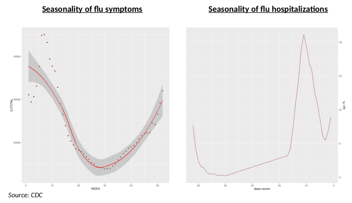
Two questions come to mind after doing this: 1) is the seasonality stable over time and 2) how does this compare to French data?
The first one is rather easy: almost every year the flu peaks on week 6 (we have 20 years of data) and the curve below, which shows severe cases over a ten-year period, is also rather straightforward: the shapes are very similar, although, of course, some years are much worse.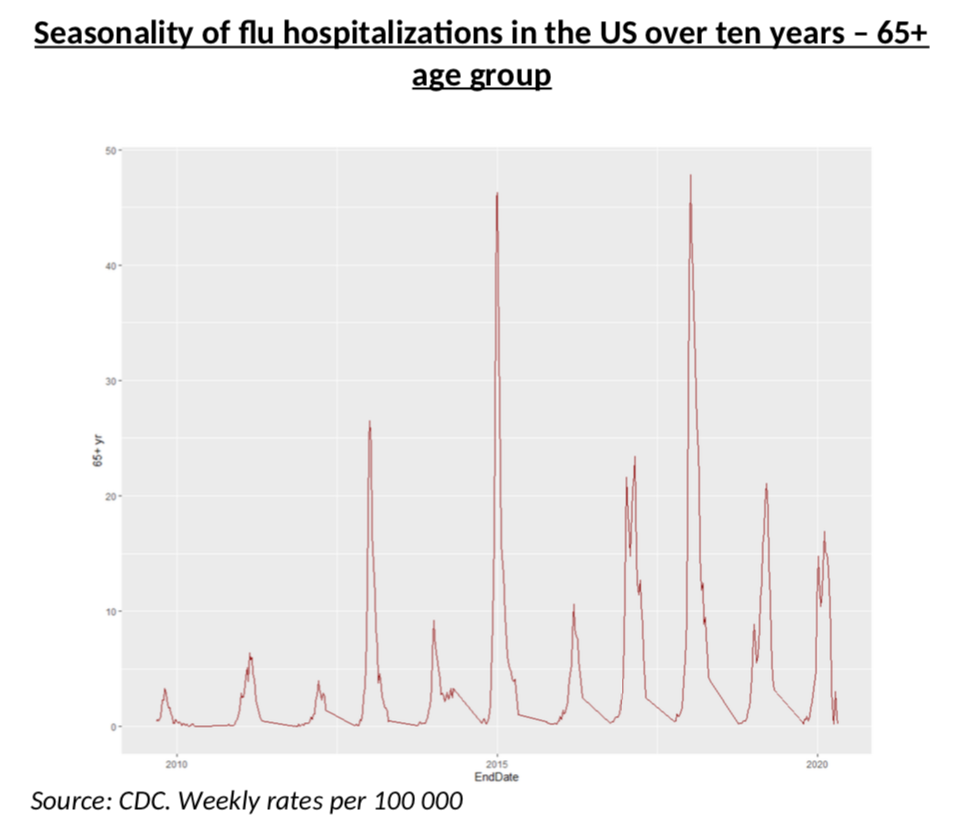
The second question is a bit trickier.
First, regarding the shape, it is pretty clear that they are similar in the US and in France. For example, peaking on week 6 is also a feature in France (but not always, of course, see below). However, the scale, i.e. the magnitude of the peak is more complicated to assess. Fortunately, we also have data for France, although in a less “statistics friendly” format.
What the chart below chart shows, is that the current flu in France has a classic shape, peaking in week 6, but its severity is 50% of the severity of last year (300 vs 600). That is not perfect, of course, but it still looks like a very good match. We can now map the 2018 flu season in the US to the current 2019 French flu season with a scaling factor. This gives us the first brick of the model: probability of having mild and severe flu symptoms, on a daily basis.
What we still need is the probability of having Covid mild and severe symptoms – and of course that is the end game of our model. That is really what we want to know! Is R going down more than we can see in the raw data, or not?
To test that scenario, let us assume that R is perfectly estimated and that the actual share of the infected population (per age band) follows exactly the process corresponding to that R. With a bit of smoothing and simplification of the simulation, this is what the daily incidence data (should) looks like if, it one assumes perfect consistency with my estimated R.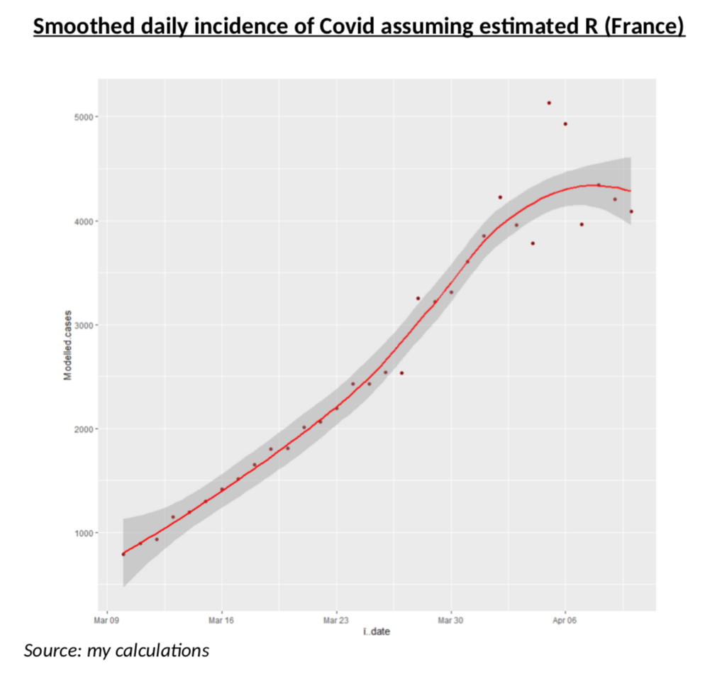
Before we can actually test the Bayesian model, we need to solve one more problem: how likely to be severe is Covid? Unfortunately, it is extremely difficult to have a view on this, because the data we have (number of ICU, of hospitalizations etc.) is either of very poor quality or do not split per age band, or simply reflect the current situation of the hospitals and in no way the actual medical impact of the virus.
This is why I believe truly meaningful data can only be obtained from the clinical studies (here, here or here) of the Diamond Princess: on that cruise ship, everyone was systematically tested and the number of patients was enough to be statistically significant. This is probably the most reliable clinical data on Covid and it includes all the persons with the virus, but no symptoms, something we are very unlikely to get anywhere else. The only problem, of course, is the age bias. Forget the TV show from the 80s, most people are rather old on those ships! What this means, in practice, is that my estimates will be more accurate for the 65+ age group, but I still tried to use that data for other age groups. The way I did this, is to use Bezier interpolation with an exponential decaying probability of having severe symptoms as one is younger, and then I fitted the parameters of that exponential decay to match the actual probabilities of severe, mild and asymptomatic patients on the ship – as well as the average age of each of the three groups. Message me if you want more details. The curve results are below. Remember, this is NOT a clinical study, just interpolations from clinical studies that looked at a population with an average age of 67.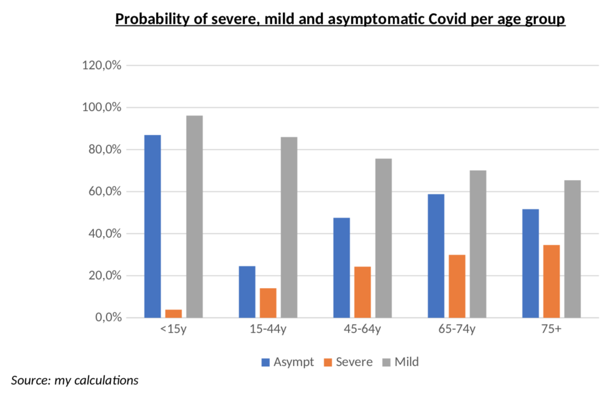
One last detail before we get to the results: I had to smooth weekend data for the number of tests, simply because it is totally obvious that weekend testing does not work like weekday testing, as you can see from the average numbers of tests every day of the week. This is yet another area where we need smoothing of the raw data.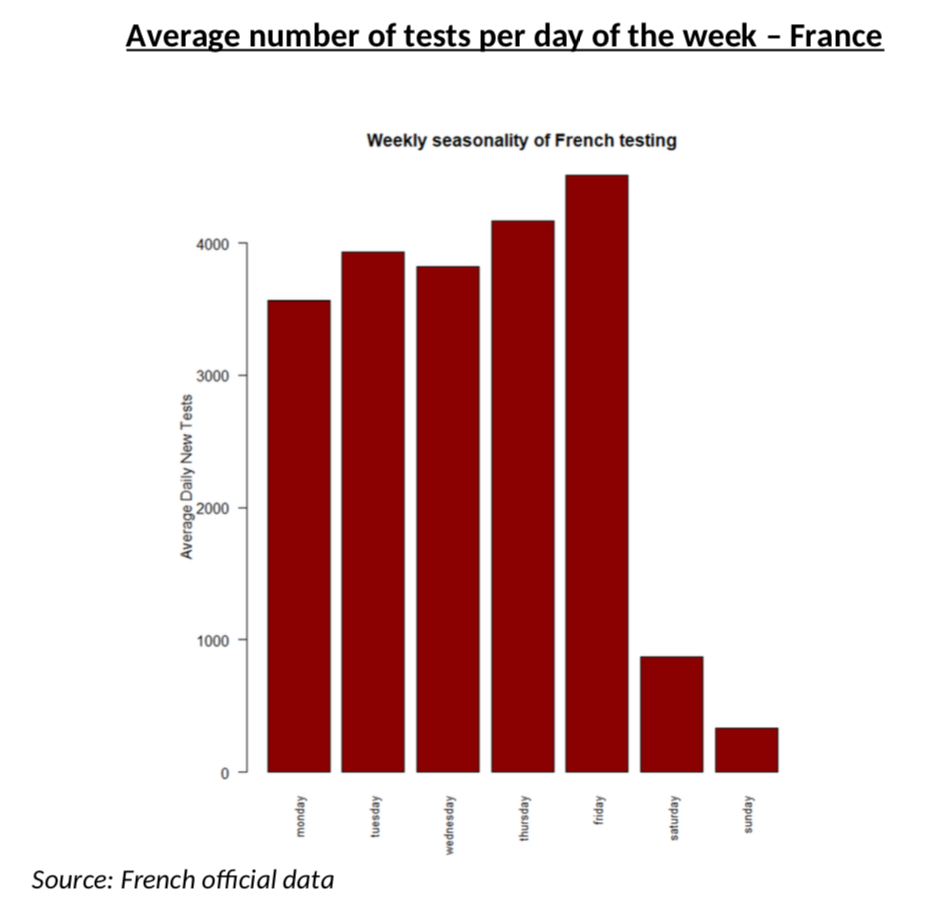
Stop all this, please give us the results!
It is more than time to get to the results, now!
Let’s start with the oldest age group, 75+. Remember, for this age group, the Diamond Princess data should be more accurate and we have more testing (so less errors.)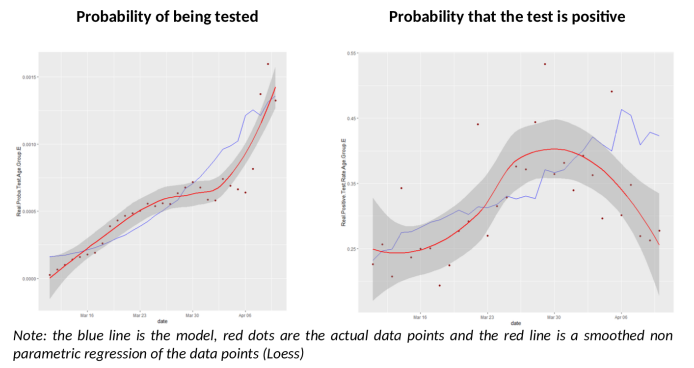
What have we got here? The model does an excellent job of predicting both the number of tests in the population and the rate of positive tests. But we also see that, as of April 3rd , the rate of positive tests diverges a bit from the model and goes down unexpectedly.
What about the other age groups? Let us look at groups D and C, more reliable than A and B.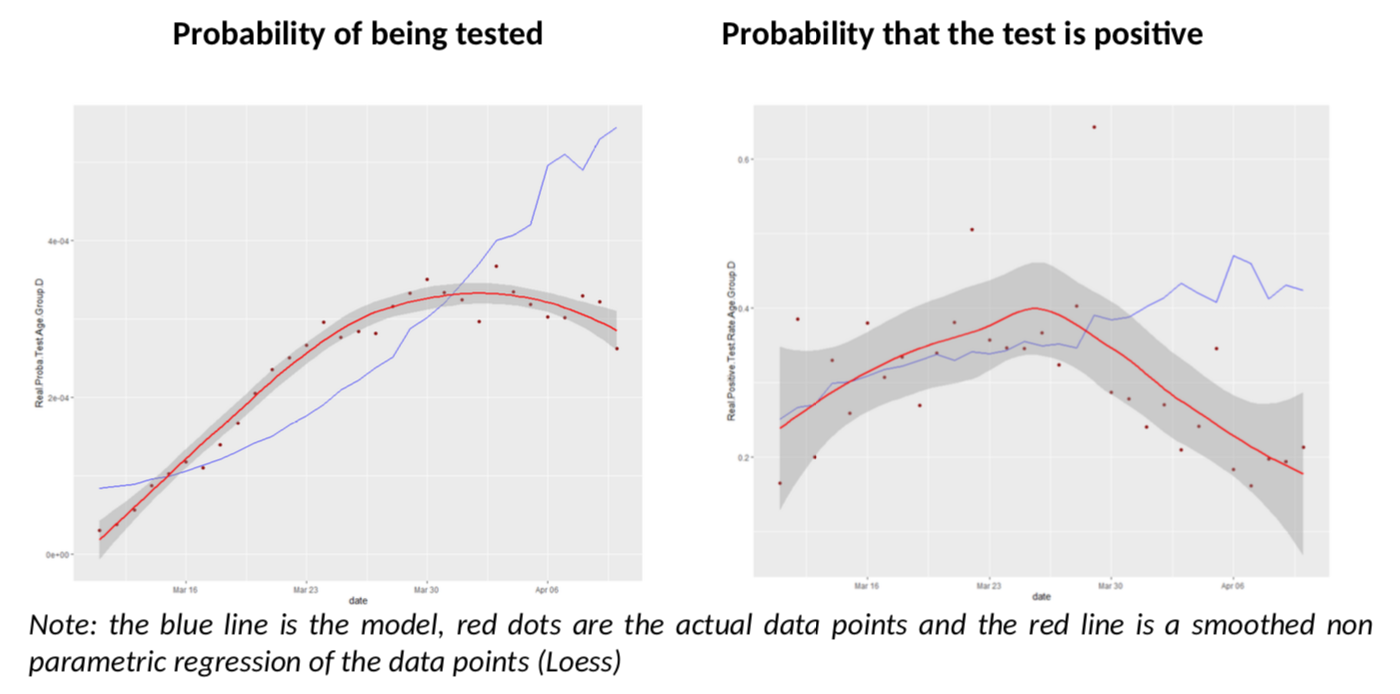
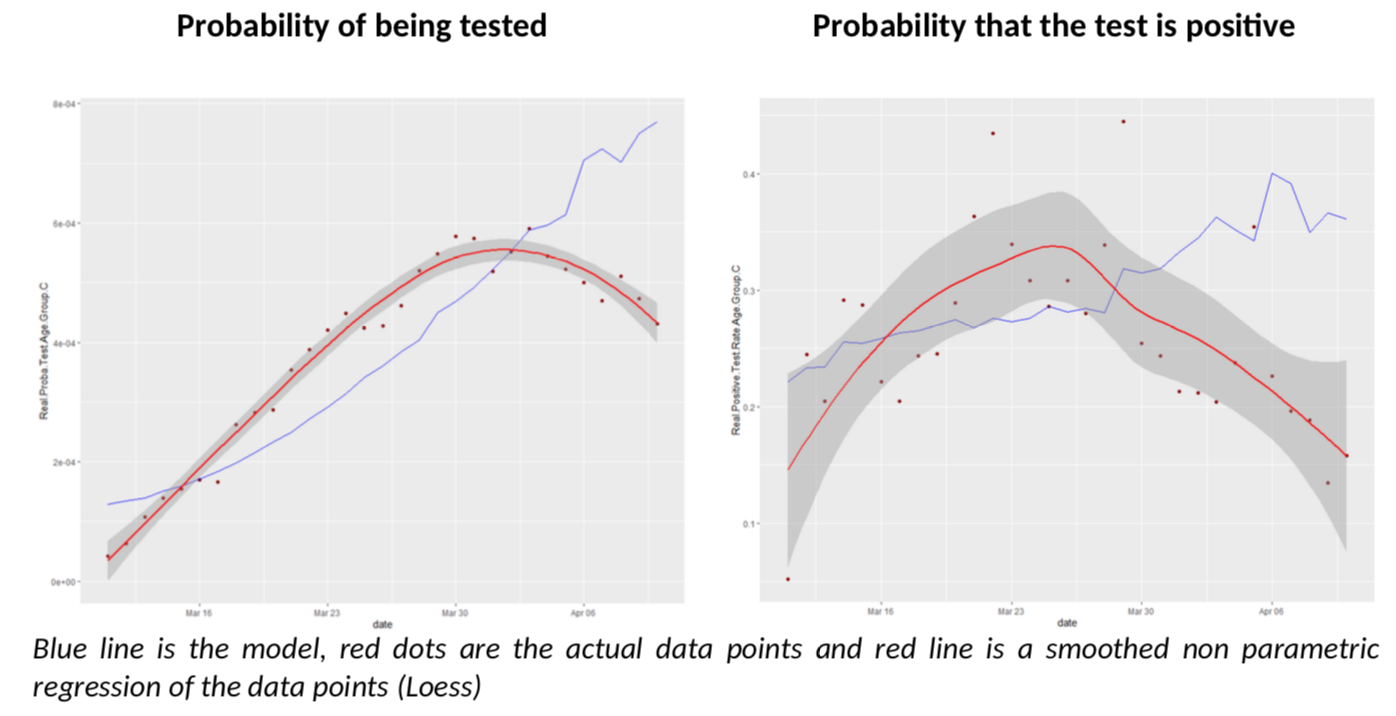
I must say I am quite impressed; I did not expect the model to give such clear conclusions: for all age groups, there seem to be a break in the model fit, slightly before or after March 30th. Remember, the various age groups have totally independent testing data, there is no reason a priori they should show the same pattern, compared to the Covid-Flu Bayesian model.
And that pattern is always the same: the actual rate of positive tests is lower than expected, but the predicted number of tests is also above the reality. This is especially relevant, as the flu peak is behind us, so its effect on testing should go down. There is only one explanation to the situation: we have sharply increased the number of testing by reducing the threshold of testing AND the estimate of R is biased upwards. The simple increase of testing is not enough to explain the patterns because it is already included in the model (but a bias on R is not.)
Ultimately, what conclusions can we draw?
The first one is that R is overestimated in France. What is the exact number? It is next to impossible to say: estimating R itself is complex task, but if you introduce noise in the data – like this analysis suggests there is – it becomes a heroic effort, not to mention the fact that there is no reason why R would not be different is various age bands!
To avoid being totally frustrated, I have just made a simple calculation, which is to use the 75+ age group, for which the Diamond Princess data is, I believe, relevant, and for which I believe testing is rather extensive in France, so statistics are less noisy. What would it get to move the modelled positive test rate closer to the actual one after April 3rd? This is how it looks if R moves linearly to end up closer to 0.55.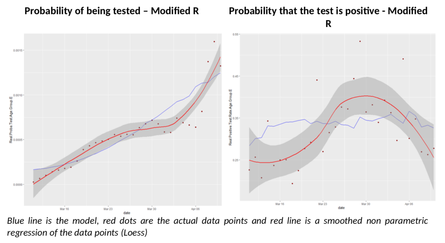
The fit on positive test rates is clearly better after March 30th. But by no means is this a proof that R is at 0.55 in France (I wish). It simply illustrates the complexity of the problem we are facing with inconsistent data.
So rather than a headline number, the bottom line that the Bayesian model shows quite well (imho) that R is overestimated. By how much, this is another story.
The second conclusion I get at, is that the total number of cases is underestimated, which will surprise exactly no one. Without any correction to R estimates, the model says there were 389k cases over the period as opposed to 89k reported.
A final word as a disclaimer: this is not a “scientific” work. I have not calculated “error bars” (I think they are bullshit anyway, as the main source of error is not statistical noise, but model misspecification), I haven’t tested many alternative hypotheses, etc. Please, keep your flamethrowers at bay. But I find compelling rationale in the Bayesian approach to understand what the probability of testing and of positive testing should be – and the flu is very likely to be the main driver here. So, if this is enough to convince serious epidemiologists to look into it, that will suffice to my happiness (on top of now having very good reasons to believe R is below what current estimates say.)
Thanks for this post.
What is the source for that R chart data, by the way?
If you take reported Deaths of 21k and apply an assumption to fatality rate of 1%, then you will find that France had at least 2.1 mm infections. So any R number based on reported new cases is so dirty as to be useless.
Next the reason R does not appear to be coming down for the country as a whole because it’s aggregating different clusters (a social unit defined as cities and towns) which are all in different stages. If you look at a single cluster (so one social unit), you’ll find that R is coming down dramatically. Just look at the Italian city death counts that IHME published.
Thanks for the post. One thing I don’t follow is in the isn’t the probability of a positive test zero if you are not tested ie P(+|NT)=0. Therefore, the formula becomes P(+|T) = P(+)/P(T)?